Page 1 of 1
FINAL FACTIONAL LOGOS
Posted: Fri Aug 25, 2006 11:35 am
by Oblivion
..at least I hope it's final.
..Wait! listen to me first before compalining.

The proposed logos once were too complicated ot be used on the ships. i.e. they work well on flags but not on starship hulls.
So here are the logos I used. I complete each as I go on. Some I made myself , some derived from fonts, etc. all are original, however.
Confed Navy Primary:(Which looks better?)


Confed Navy Secondary:


Homeland Security Primary:

Homeland Security IntelSec:

Merchant Primary:

Purist Primary:(BTW: WHAT is the official designation for Purists?)

Pirate Primary:

Suggestions. Etc. Please only react if you have something to replace these.

lol. It's tiresome to squabble on logos.
Posted: Fri Aug 25, 2006 11:49 am
by charlieg
I love that pirate logo.
I'd be interested to see the confed logo with a blue eagle, gold U, and white star combined. The current eagle/U combinations blend together too much making it hard to look at. Logos should be clean.
Posted: Fri Aug 25, 2006 11:56 am
by Oblivion
blue eagle, gold U, and white star
Okey Doke.

Posted: Fri Aug 25, 2006 12:35 pm
by Zeog
Bravo again for all the work and ideas. Here are my first thoughts:
The Confed Navy promary logos are too crowded. The contrast between eagle u-shape and background isn't good enough (white and white on white or black and black on dark blue). If you make these pictures smaller none of these shapes can be distinguished.
Why didn't you take that four-pointed star from the homeland security texture of the admonisher? To me, it looks more prominent than the white five-pointed version. Also the blue seems too saturated when compared to it. Isn't the color theme desaturated (with a little grey) blue and grey?
I like the colors of the Merchant logo. They go well together. I'm not too fond of initials though. (You know, it's the future. Writing could be different.) What do you think of a more octagon shape instead of a square and then adding some internal structure also playing with different line widths?
The pirate logo looks good. There just remains the question why pirates with very probably stolen ships (good disguise) are giving them a paint job (bad disguise).
Posted: Fri Aug 25, 2006 12:41 pm
by Oblivion
The Confed Navy promary logos are too crowded.
Okay, I'll try a stylized eagle form, as I was intending to,
.
Why didn't you take that four-pointed star from the homeland security texture of the admonisher
oh eyah, forgot.

But it only exists for the admonsher. Other ships have the more prominent shield.
And yeah, teh blue is a different shade, no worries tho, I'll provide proper hue next time.
I'll see what I can do with the merchie
The pirate logo looks good. There just remains the question why pirates with very probably stolen ships (good disguise) are giving them a paint job (bad disguise).
disguises are useless anyway, probably with ship masking and all. As I said, it's for fun
Maybe their kingpins ride in style.
Thanks for feedback. Have to go now.
Posted: Fri Aug 25, 2006 12:48 pm
by Cockroach
Maybe have pirates pick a scheme at random. Anything barring Aeran and Rlaan could really be expected (including the pirate one, it kicks ass!).
Posted: Sun Aug 27, 2006 11:29 am
by Oblivion
Cockroach:
Maybe have pirates pick a scheme at random. Anything barring Aeran and Rlaan could really be expected (including the pirate one, it kicks ass!).
well, anything goes.. But I'll still be providing a logo for them.. heh

if only for coolness.

Well new logo proposals:
ConfedSecondary

ConfedPrimary

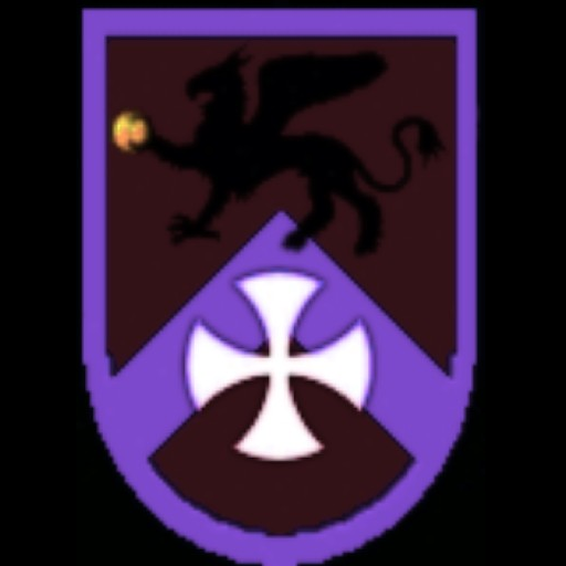
Highborn:
(The color scheme sucks, I know, but it's teh only one that blends in with the HB ship colors - purple and orange)
others still WIP.
Posted: Thu Aug 31, 2006 4:42 am
by Oblivion
darn forgot the new proposals!
Anyway, forget about these. Some will do some won't. What matters is they would look good on ships. Don't shoot me okay?