Vega Strike Menus and Logotype
Posted: Sat Dec 03, 2011 7:25 pm
In conjunction with coming up with a new HUD, I've been working on redesigning the in-game menus and by extension working on new Vega Strike Logotype.
I've zipped them here http://www.box.com/s/ko8a453usfik7dk4z8r5 because they look much better seen full screen.
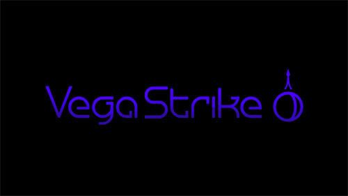
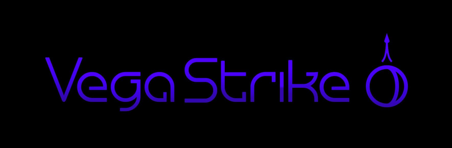
Current Logo

New Logo
http://i443.photobucket.com/albums/qq15 ... ogoNew.jpg
Current Icon

New Icon

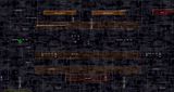
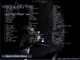
Current Main Menu

New Main Menu

Current Intro Screen
New Intro Screen

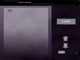
Current Load Screen
New Load Screen

Current Multiplayer Screen
New Multiplayer Screen

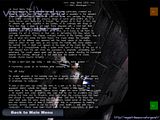
Current Credits Screen
New Credits Screen (credits are just provisional )
)

The aim with the new logo was to build on the current one but to focus on making it a bit more versatile in graphic design terms, as to readability, background matching, scalability and so on.
If people like it I can also work on a new website/forum theme etc, a more coherent graphic design for VS as a whole would hopefully attract more people to contribute and build on the momentum that the project finally seems to be acquiring.
I've zipped them here http://www.box.com/s/ko8a453usfik7dk4z8r5 because they look much better seen full screen.
Current Logo
New Logo
http://i443.photobucket.com/albums/qq15 ... ogoNew.jpg
Current Icon
New Icon
Current Main Menu

New Main Menu

Current Intro Screen

New Intro Screen

Current Load Screen

New Load Screen

Current Multiplayer Screen

New Multiplayer Screen

Current Credits Screen

New Credits Screen (credits are just provisional

The aim with the new logo was to build on the current one but to focus on making it a bit more versatile in graphic design terms, as to readability, background matching, scalability and so on.
If people like it I can also work on a new website/forum theme etc, a more coherent graphic design for VS as a whole would hopefully attract more people to contribute and build on the momentum that the project finally seems to be acquiring.